 2023年雅思图表题范例

《2023年雅思图表题范例》由会员分享,可在线阅读,更多相关《2023年雅思图表题范例(12页珍藏版)》请在装配图网上搜索。
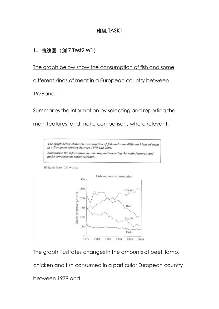
1、雅思TASK11、曲线图(剑7 Test2 W1)The graph below show the consumption of fish and some different kinds of meat in a European country between 1979and .Summaries the information by selecting and reporting the main features, and make comparisons where relevant.The graph illustrates changes in the amounts of be
2、ef, lamb, chicken and fish consumed in a particular European country between 1979 and .In 1979 beef was by far the most popular of these foods, with about 225 grams consumed per person per week. Lamb and chicken were eaten in similar quantities (around 150 grams), while much less fish was consumed (
3、just over 50 grams).However, during this 25-year period the consumption of beef and lamb fell dramatically to approximately 100 grams and 55 grams respectively. The consumption of fish also declined, but much less significantly to just below 50 grams, so although it remained the least popular food,
4、consumption levels were the most stable. The consumption of chicken, on the other hand, showed an upward trend, overtaking that of lamb in 1980 and that of beef in 1989. By it had soared to almost 250 grams per person per week.Overall, the graph shows how the consumption of chicken increased dramati
5、cally while the popularity of these other foods decreased over the period.2、柱状图(C3T3W1)You should spend about 20 minutes on thistask. Thecharts below show the levels of participation in education and science indeveloping and industrialized countries in 1980 and 1990. Write a report a university lect
6、urer describing the information shownbelow.You should write at least 150 words.The data shows the differences between developing and industrialized countries participation in education and science.In terms of the number of years of schooling received, we see that the length of time people spend at s
7、chool in industrialized countries was much greater at 8.5 years in 1980, compared to 2.5 years in developing countries. The gap was increased further in 1900 when the figures rose to 10.5 years and 3.5 years respectively.We can see a similar pattern in the second graph, which shows that the number o
8、f people working as scientists and technicians in industrialized countries increased from 55 to 85 per 1,000 people between 1980 and 1990, while the number in developing countries went from 12 to 20.Finally, the figures for spending on research and development show that industrialized countries more
9、 than doubled their spending, from $200bn to$420bn, while developing countries decreased theirs , from$75bn down to $25bn.Overall we can see that not only are there very large differences between the two economies but that there gaps are widening.3、饼状图(C7T4W1)The charts compare the sources of electr
10、icity in Australia and France in the years 1980 and . Between these years, electricity production almost doubled, rising from 100 units to 170 in Australia, and from 90 to 180 units in France.In 1980 Australia used coal as the main electricity source (50 units) and the remainder was produced from na
11、tural gas, hydro power (each producing 20 units) and oil (which produced only 10 units). By , coal had become the fuel for more than 75% of electricity produced and only hydro continued to be another significant source supplying approximately 20%.In contrast, France used coal as a source for only 25
12、 units of electricity in 1980, which was matched by natural gas. The remaining 40 units were produced largely from oil and nuclear power, with hydro contributing only 5 units. But by , nuclear power, which was not used at all in Australia, had developed into the main source, producing almost 75% of
13、electricity, at 126 units, while coal and oil together produced only 50 units. Other sources were no longer significant.Overall, it is clear that by these two countries relied on different principal fuel sources: Australia relied on coal and France on nuclear power.4、表格类(C5T4W1)The take below gives
14、information about the underground railway systems in six cities.Summarise the information by selecting and reporting the main features, and make comparisons where relevant. You should write at least 150 words.The table shows the detailed information regarding the underground railway systems in six c
15、ities, namely, London, Paris, Tokyo ,Washington DC, Kyoto and Los Angeles.London has the oldest underground railway system among the six cities which was opened in 1863. AndParis is the second oldest, and it was opened in 1900. This was then followed by other four cities, namely,Tokyo,WashingtonDC a
16、ndKyoto with the opening date of 1927, 1976, and 1981 respectively. As forLos Angeles, it is the last one in this table to have its own underground railway system (opened in ).In terms of the size of the railway system, Londonenjoys the largest underground railway systems, with 394 kilometres of rou
17、te in total, which is nearly twice as large as that in Paris(199 kilometres). Kyoto, in contrast, has the smallest system, for it only has 11 kilometres of route, which is nearly 1/36 of the route of London. The other three cities(Tokyo, Washington DC, and Los Angeles) have 155, 126 and 28 kilometre
18、s respectivelyInterestingly, Tokyo, which only has 155 kilometres of route, enjoys the greatest number of passengers per year, at 1927 million passengers. The system inParis has the second greatest number of passengers, at 1191 millions passengers per year. The smallest underground railway system,Ky
19、oto, serves the smallest number (only 45 people).In conclusion, the underground railway systems in different cities vary a lot in the opening date, the size as well as the number of passengers served per year.5、地图题(真题)The following two maps show the development of a coastal city from 1950 to .Summar
20、ize the information by selecting and reporting the main features, and make comparisons where relevant.The two maps illustrate the changes of a coastal city between 1950 and . We can see clearly that the city became more and more modern.1n 1950, the city was like a small village, with vast grassland
21、areas all over the city. There was a sea in the north of this city, with a park to the west. In front of the park, there was a big building area where things were under construction. By that time, three large areas were all grasslands, with a cross road dividing them.However, when it comes to , thin
22、gs experienced significant changes. A new apartment had been built where the park was, and the original building areas were converted into industry buildings such as parks, parking lots and swimming pools. The most obvious changes were that the former grasslands disappeared, becoming cinemas in the
23、southwest, shops in the southeast, and houses in the northeast. On the north side, although the sea was still there, a wharf was built in it so people could travel more easily by sea.Finally, although there was still a cross road in the city, the horizontal road was moved to the south. By doing so,
24、industry buildings and houses could be left more places to develop. Anyway, the city had experienced tremendous changes throughout the 57-year period.6、流程图(C6T3W1)The first diagram shows that there are four main stages in the life of the silk worm.First of all, eggs are produced by the moth and it t
25、akes ten days for each egg to become a silkworm larva that feeds on mulberry leaves. This stage lasts for up to six weeks until the larva produces a cocoon of silk thread around itself. After a period of about three weeks, the adult moths eventually emerge from these cocoons and the life cycle begin
26、s again.The cocoons are the raw material used for the production of silk cloth. Once selected, they are boiled in water and the threads can be separated in the unwinding stage. Each thread is between 300 and 900 metres long, which means they can be twisted together, dyed and then used to produce cloth in the weaving stage.Overall, the diagrams show that the cocoon stage of the silkworm can be used to produce silk cloth through a very simple process.
- 温馨提示:
1: 本站所有资源如无特殊说明,都需要本地电脑安装OFFICE2007和PDF阅读器。图纸软件为CAD,CAXA,PROE,UG,SolidWorks等.压缩文件请下载最新的WinRAR软件解压。
2: 本站的文档不包含任何第三方提供的附件图纸等,如果需要附件,请联系上传者。文件的所有权益归上传用户所有。
3.本站RAR压缩包中若带图纸,网页内容里面会有图纸预览,若没有图纸预览就没有图纸。
4. 未经权益所有人同意不得将文件中的内容挪作商业或盈利用途。
5. 装配图网仅提供信息存储空间,仅对用户上传内容的表现方式做保护处理,对用户上传分享的文档内容本身不做任何修改或编辑,并不能对任何下载内容负责。
6. 下载文件中如有侵权或不适当内容,请与我们联系,我们立即纠正。
7. 本站不保证下载资源的准确性、安全性和完整性, 同时也不承担用户因使用这些下载资源对自己和他人造成任何形式的伤害或损失。
