 统计基础与品质统计.ppt

《统计基础与品质统计.ppt》由会员分享,可在线阅读,更多相关《统计基础与品质统计.ppt(92页珍藏版)》请在装配图网上搜索。
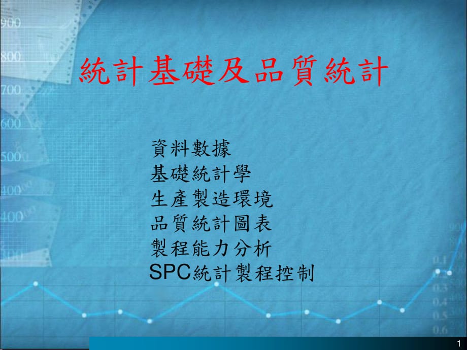
1、1 統計基礎及品質統計 資料數據 基礎統計學 生產製造環境 品質統計圖表 製程能力分析 SPC統計 製程 控制 2 資料及數據 3 你想瞭解什麽 ? 資訊源 : 分組 離散型 名義型 順序型 間距型 “ 資料本身並不能提供資訊 必頇對資料加以處理以後 才能得到資訊 , 而處理資料的工具就是統計學 ” . 衡量 連續型 比率型 文字的 (A to Z) 圖示的 口頭的 數位的 (0-9) 數據 4 FAIL PASS 計時器 NO-GO GO 數量 單價 說明 總價 1 $10.00 $10.00 3 $1.50 $4.50 10 $10.00 $10.00 2 $5.00 $10.00 裝貨單
2、 離散型資料和連續型資料 電氣電路 溫度 溫度計 連續型 離散型 卡尺 錯誤 5 $ $ 連續資料的優勢 連續的 信息量少 信息量多 6 離散型資料 (通常 ) 分組 / 分類 是 /否 , 合格 / 不合格 不能計算 離散型資料 分級 很少用 很難加以計算 連續型資料 最常見的尺規 計算時要很小心 連續型資料 比例關係 可應用演算法的多數公式 分類 標簽 第一、第二、第三 相對高度 字母順序 123 0 1 = 0 1 0 2 = 0 2 Basic Statistics Display Descriptive Statistics Graphs Graphical Summary A2 2
3、7.11 描述性統計 圖形分析總結 變數:神秘 中值的 95%信賴區 間 的 95%信賴區間 Anderson-Darling常態測試 P值 0.00 均 值 100.00 標準偏差 32.38 變異數 1048.78 偏度 0.01 峰度 -1.63 資料量 500.00 最小值 41.77 第一象限 68.69 中值 104.20 第三象限 130.81 最大值 162.82 的 95%信賴區間 97.5 102.85 s的 95%信賴區間 30.49 34.53 中值的 95%信賴區間 82.78 117.66 31 資料收集時的重點 How the data are collected
4、 affects the statistical appropriateness and analysis of a data set(資料如何收集可影響統計的適切性 ). Conclusions from properly collected data can be applied more generally to the process and output. Inappropriately collected data CANNOT be used to draw valid conclusions about a process. Some aspects of proper dat
5、a collection that must be accounted for are: The manufacturing environment(製程環境 )from which the data are collected. When products are manufactured in batches or lots, the data must be collected from several batches or lots. Randomization(隨機 ). When the data collection is not randomized, statistical
6、analysis may lead to faulty conclusions. 32 Continuous Manufacturing (連續 )occurs when an operation is performed on one unit of product at a time. An assembly line is typical of a continuous manufacturing environment, where each unit of product is worked on individually and a continuous stream of fin
7、ished products roll off the line. The automotive industry is one example of Continuous Manufacturing. Other examples of continuously manufactured product are: television sets, fast food hamburgers, computers. Lot/Batch Manufacturing (批次 ) occurs occurs when operations are performed on products in ba
8、tches, groups, or lots. The final product comes off the line in lots, instead of a stream of individual parts. Product within the same lot are processed together, and receive the same treatment while in-process. Lot/Batch Manufacturing is typical of the semiconductor industry and many of its supplie
9、rs. Other examples of lot/batch manufactured product include: chemicals, semiconductor packages, cookies. Manufacturing Environment製造環境 33 In Continuous Manufacturing the most important variation is between parts In Lot/Batch Manufacturing, the variation can occur between the parts in a lot and betw
10、een the lots: Product within the same lot is manufactured together. Product from different lots are manufactured separately. Because of this, each lot has a different distribution. This is important because Continuous Manufacturing is a basic assumption for many of the standard statistical methods f
11、ound in most textbooks or QC handbooks. These methods are not appropriate for Lot/Batch Manufacturing. Different statistical methods need to be used to take into account the several sources of variation in Lot/Batch Manufacturing. 要注意 : 連續和批量生產所用的統計方法有些不同 34 With Lot/Batch Manufacturing, each lot ha
12、s a different mean. Due to random processing fluctuations, these lots will vary even though the process may be stable. This results in several “levels” of distributions, each level with its own variance and mean: A distribution of units of product within the same lot. A distribution of the means of
13、different lots. The total distribution of all units of product across all lots. Lot X 1 2 3 4 5 * * * * * * * * * * Distribution of Individual Lot Distribution of Lot Means Overall Distribution of Combined Lots Variation Within Each Lot Variation Between Lots Total Variation 35 The different varianc
14、es of a Lot/Batch Manufacturing process form a hierarchy called nesting. Data collected from such processes usually have what is called a nested data structure. 1 1 2 1 2 3 4 5 1 2 3 4 5 LOTS 班 2 1 2 1 2 3 4 5 1 2 3 4 5 Each of the levels in the nested structure corresponds to a single variance. Wit
15、h a nested data set from this process, we need to take each source of variation into account when collecting data to ensure the total process variation is represented in our data set: 222 L o t 2 T o t a l 線班 ssss 生產線 36 2 2 2 2 2 2 2 X 1 2 X 2 2 1 2 1 2 1 , , ; X ; X ; X X X X s + = + = = = = 總 總 總
16、 6s原則 變異數可相加 , 標準差則不能相加 輸入變數變異數相加計算輸出中的總變異數 所以 那麽 引起的變異數輸入變數 引起的變異數輸入變數 過程輸出的變異數 如果 s s s s s s s s 37 1 2 3 4 5 6 Lot sWithin is small sLot is large process has small within-lot variation and large lot-to-lot variation (which is very common), data values from the same lot will be highly correlated,
17、 while data from different lots will be independent: 38 品質統計圖表 直方圖 (Histograms) 方框圖 (Boxplots) 柏拉圖 (Pareto Diagrams) 散佈圖 (Scatterplots) 趨勢圖 (Trend Charts) 39 品質統計圖表 -直方圖 (Histograms) Histograms provide a visual description of the distribution of a set of data. A histogram should be used in conjuncti
18、on with summary statistics such as and s. A histogram can be used to: Display the distribution of the data(現示數據的分佈 ). Provide a graphical indication of the center, spread, and shape of the data distribution (較定性地顯示數據的均值 ,散佈及形狀 ). Clarify any numerical summary statistics (which sometimes obscure info
19、rmation). (顯示較模糊的統計結果 ). Look for outliers - data points that do not fit the distribution of the rest of the data. (顯示異常點 ) x 40 : : . . . : . . : : :.: : . : . : . .:.:.:.:.:.: : . -+-+-+-+-+-加侖 /分鐘 49.00 49.50 50.00 50.50 51.00 點圖分佈 設想有一個泵流量爲 50加侖 /分鐘的計量泵 。 按照節拍對泵的實際流量進行了 100次獨立測量 。 畫出各個點,每點代表一個給定
20、值的輸出 “ 事件 ” 。 當點聚集起來時,泵的實際性能狀況可以看作泵流 量的 “ 分佈 ” 。 41 5 1 .3 5 0 . 8 5 0 . 3 4 9 . 8 4 9 . 3 4 8 . 8 4 0 3 0 2 0 1 0 0 直方圖分佈 還是這些資料,現在設想將其分組後歸入“區 間”。泵流量點落入指定區間的次數決定區間 條的高度。 頻率 加侖 /分鐘 42 品質統計圖表 -直方圖 (Histograms) 150.7 149.7 154.5 149.6 155.3 149.0 160.5 149.0 155.3 149.3 149.2 153.5 145.5 161.0 151.5 1
21、54.3 150.9 152.4 150.5 152.3 144.5 151.6 151.1 151.0 147.5 150.6 147.4 150.8 148.3 146.8 148.7 147.6 153.0 139.0 153.4 146.5 151.4 143.5 149.4 150.4 153.1 150.7 149.1 150.6 149.6 152.5 145.2 150.5 146.4 151.3 151.7 145.6 147.1 152.6 147.0 148.5 155.0 148.4 151.3 148.8 146.7 152.7 155.3 146.6 144.8 1
22、50.9 149.5 151.4 147.3 154.9 151.2 148.6 142.5 151.6 151.0 152.9 146.9 145.3 150.8 150.3 153.6 154.6 150.6 148.6 155.1 145.4 148.5 157.0 148.9 145.0 147.7 151.1 149.7 154.4 149.1 151.5 153.3 149.5 152.8 150.8 140 145 150 155 160 43 品質統計圖表 -直方圖 (Histograms) . 0 4 0 . 0 4 5 . 0 5 0 . 0 5 5 . 0 6 0 . 0
23、 6 5 . 0 7 0 . 0 7 5 0 2 4 6 8 10 . 0 0 0 . 0 2 5 . 0 5 0 . 0 7 5 . 1 0 0 . 1 2 5 Multi-Modal Shape(雙峰 ): Skewed Shape(偏一邊 ): Data can be right-skewed or left- skewed. This data is right-skewed the right tail is longer than the left tail. Outliers:特異點 44 練習 45 品質統計圖表 -方框圖 (Boxplots) Boxplots are a g
24、raphical tool valuable for comparing the distributions of two or more groups (e.g., different lots, shifts, operators, etc.). Each distribution on this chart consists of the following: A “box” representing the middle 50% of the data values. The length of the “box” is called the “Interquartile Range”
25、 (IQR). Inside the “box” is a line representing the median (50th percentile) of the data. Two “tails” which extend out to the minimum and maximum data values (assuming there are no outliers in the data). If the distance between the a data point and the nearer quartile is greater than 1.5xIQR, the da
26、ta point is labeled as an outlier, and the “tail” on that side of the boxplot is shortened to the outermost data value within 1.5xIQR from the quartile. 46 品質統計圖表 -方框圖 (Boxplots) Median Maximum Data Value 75th Percentile 25th Percentile Outermost data values within 1.5xIQR of the 75th and 25th Perce
27、ntiles. Outlier NO OUTLIERS IQR OUTLIERS Minimum Data Value Outlier 1.5xIQR 47 品質統計圖表 -方框圖 (Boxplots) EXAMPLE : Creating a Boxplot The figure below is a boxplot of the 100 plating thickness measurements. The histogram for the same data set is displayed for comparison. 140 145 150 155 160 9 5 % C o n
28、 f i d e n c e In te r v a l f o r M e a n “ S h o rte s t H a lf” - De n s e s t re g i o n o f d a ta , ( c o n ta i n s 5 0 % o f d a ta ) . 48 品質統計圖表 -方框圖 (Boxplots) Lot 1 Lot 2 Lot 3 Lot 4 Lot 5 Lot 6 Lot 7 149.18 144.78 146.77 167.85 144.51 134.96 152.41 151.31 147.18 150.66 164.17 144.41 134.
29、7 146.76 150.8 145.66 145.11 168.23 146.68 135.02 148.19 149.06 147.09 145.09 162.88 145.4 134.63 143.75 151.73 145.86 145.98 163.1 143.3 134.87 153.71 148.15 144.64 146.77 166.91 146.87 135.34 145.13 152.55 143.67 149.9 165.78 148.61 134.6 148.54 130 135 140 145 150 155 160 165 170 L o t 1 L o t 2
30、L o t 3 L o t 4 L o t 5 L o t 6 L o t 7 L o t N o . Plating thickness measurements collected from 7 lots of product. 49 品質統計圖表 -方框圖 (Boxplots) . 0 4 0 . 0 4 5 . 0 5 0 . 0 5 5 . 0 6 0 . 0 6 5 . 0 7 0 . 0 7 5 0 2 4 6 8 10 . . . 90 95 100 105 Multi-Modal Shape: Skewed Shape: Outliers: 50 練習 51 品質統計圖表 -
31、柏拉圖 (Pareto Diagrams) While histograms are used to display the distribution of a set of continuous (measured) data, Pareto diagrams are used to display the distribution of discrete (counted) data, such as different types of defects. Pareto diagrams can also be used with continuous (measured) data, p
32、articularly in displaying variance components analysis results, as we will see later in this course. Pareto diagrams are a useful tool for determining which problems or types of problems are most severe or occur most frequently, hence should be given high priority for process improvement efforts. Pa
33、reto diagrams separate the significant vital few problems from the trivial many to help determine which problems to address first (and which to address later). 重點中找重點 ! 52 Pareto圖分析 Pareto 圖 根據 frequency 欄的內容判斷 各個缺陷影響的大小,並按從大到小的 次序排列。 最後一組總是標有 “ 其他 ” , 並以默 認方式包括所有缺陷的分類計算 , 這幾 類缺陷非常少 , 它們占總缺陷的 5% 以 下
34、 。 該圖右側 Y 軸表示占總缺陷的百分比 , 左側 Y 軸表示缺陷數 。 紅線 (在螢幕上可以看到 ) 表示累積百分 比,而直方圖表示每類缺陷的頻率 (占 總量的百分比 ) 。在圖的下方列出所有 的值 百 分 比 缺陷的 Pareto圖 缺陷 計數 274 59 43 19 10 18 百分比 64.8 13.9 10.2 4.5 2.4 4.3 累積百分比 64.8 78.7 88.9 93.4 93.4 100.0 400 300 200 100 0 100 80 60 40 20 0 品質統計圖表 -柏拉圖 (Pareto Diagrams) 53 Pareto圖分析 : 創建一個加權
35、的 Pareto圖 通過指定金額 /缺陷或用其他的加權方法, 可以給次數加權。 列在 C1中的缺陷發生次數的價格列在 C3 (value) 中 , 價格乘以次數等於這類缺陷 的費用 (c4) 。 繪製費用( cost) 曲線圖,而不是繪製次 數( count) 圖, 這樣可以更好地說明每 個缺陷對業務的影響。 缺陷的 Pareto圖 缺陷 計數 2320.71 1653.00 1230.00 800.00 349.87 155.52 百分比 35.7 25.4 18.9 12.3 5.4 2.4 累積百分比 35.7 61.0 79.9 92.2 97.6 100.0 6000 5000 40
36、00 3000 2000 1000 0 100 80 60 40 20 0 品質統計圖表 -柏拉圖 (Pareto Diagrams) 54 層別 Pareto圖 : 解釋分組資料 上圖使用了一個 By Variable( 從屬變數), 所有的圖都在一頁上。 下圖使用同樣的命令, 沒有從屬變數。 當選擇每頁一張圖時 , 所有的圖的計數 (左軸 ) 刻度相同 。 右側的百分比只反映該圖占總體的 百分比 。 這些圖表明 , 70%的記錄缺陷是刮傷和剝落的 (下部 ), 約有一半的缺陷是夜班人員記錄的 (上 右圖 )。 此外,記錄缺陷是刮傷和剝落的比例,對白班 和夜班的 來說似乎也差不多。然而,晚班
37、和周 末班出現的缺陷樣式是不同的。 裂紋 Pareto圖 白班 晚班 夜班 周末班 刮傷 剝落 其他 污點 15 10 5 0 15 10 5 0 15 10 5 0 15 10 5 0 裂紋 Pareto圖 40 30 20 10 0 100 80 60 40 20 0 缺陷 計數 15 13 6 6 百分比 37.5 32.5 15.0 15.0 累積百分比 35.5 70.0 85.0 100.0 品質統計圖表 -柏拉圖 (Pareto Diagrams) 55 練習 56 品質統計圖表 -散佈圖 (Scatterplots) Until now, all the graphical t
38、ools weve discussed have been for examining the distribution of a single process characteristic. The scatterplot is a graphical tool for examining the relationship between two process characteristics. A scatterplot is an X-Y plot of one variable versus another. Each unit of product usually has many
39、characteristics, process input variables, etc. One objective might be to see whether two variables or characteristics are related to each other (i.e., to see what happens to one of the variables when the other variable changes). This relationship between two variables is called correlation. Scatterp
40、lots can help us answer this type of question. 57 品質統計圖表 -散佈圖 (Scatterplots) Acid Age Etch Rate Acid Age Etch Rate Acid Age Etch Rate 4.0 13 4.5 13 4.0 15 4.5 18 1.5 30 2.5 23 3.0 18 3.5 19 1.0 31 3.5 19 5.5 7 5.0 4 4.0 12 2.0 25 3.5 21 2.0 24 1.0 29 2.0 26 1.0 28 3.0 20 5.5 9 3.0 19 5.0 6 4.5 14 5.
41、0 9 5.5 9 2.5 27 2.5 25 1.5 30 1.5 31 0 5 10 15 20 25 30 35 0 1 2 3 4 5 6 Ac i d Ag e 58 品質統計圖表 -散佈圖 (Scatterplots) In addition to telling us whether or not two variables are related, scatterplots can tell us how they are related, and the strength of the relationship: Strong Positive Correlation 強正相
42、關 No Correlation無關 Weak Negative Correlation 弱負相關 Weak Positive Correlation 弱正相關 Strong Negative Correlation 強負相關 59 品質統計圖表 -散佈圖 (Scatterplots) In addition, scatterplots are an excellent tool for determining the type of relationship between the two variables, as well as looking for outliers: Linear
43、Relationship 線性相關 Outliers 特異 Non-Linear Relationship 非線性相關 60 品質統計圖表 -散佈圖 (Scatterplots) Correlation and Causation We must always take care not to confuse correlation with causation. The fact that two characteristics are correlated does not prove that one causes the other. Both may be related to so
44、me other factor which is the true root cause. Number of Televisions Number of Traffic Accidents 1970 1990 But is there a cause-effect relationship between the two? Did the increase in TVs cause the number of accidents to go up? (Not likely.) Did the increase in traffic accidents cause people to buy
45、more TVs? (Not likely, either.) 61 練習 62 品質統計圖表 -趨勢圖 (Trend Charts) Trend Charts Stability: A process is stable if its mean and standard deviation are constant and predictable over time. A disadvantage of histograms and normal probability plots is that they cannot be used to determine whether the pr
46、ocess is stable over time. A plot of the data in time order will allow us to do that. These time-ordered plots, called Trend charts and Control charts are essential when examining the stability of a distribution over time. A trend chart or a control chart can detect instability if it exists. Control
47、 charts, which are a special kind of trend chart, are discussed in detail separately in a later course module. 可看出穩定性及預測性 63 品質統計圖表 -趨勢圖 (Trend Charts) The table below contains average plating thickness measurements taken from 21 lots of product. Below that is a trend chart of the data. Lot # Platin
48、g Thickness Lot # Plating Thickness Lot # Plating Thickness 1 151.9 8 143.8 15 149.2 2 147.4 9 152.7 16 147.5 3 155.8 10 147.4 17 151.9 4 151.7 11 152.7 18 141.9 5 149.2 12 143.8 19 152.7 6 153.8 13 137.1 20 147.4 7 159.9 14 142.5 21 157.3 135 140 145 150 155 160 0 5 10 15 20 25 L o t No . 64 練習 65
49、品質統計圖表 - Noisy The results of a statistical analysis can be seriously affected by the failure of the data to meet certain required assumptions. One of the most common assumptions is that the data values are independent and that they come from a Normal distribution. This assumption can be violated in
50、 several ways: Outliers (points that do not fit the rest of the distribution) in the data, Non-Normal-shaped distributions (multi-modal or skewed distributions), Data that exhibit these characteristics can be thought of as noisy data. The procedures in this section provide techniques for effective d
51、etection and analysis of noisy data. 雜訊 66 品質統計圖表 - Noisy Boxplots Trend Chart Histogram Scatterplot Normal Prob. Plot 67 品質統計圖表 - Noisy Recommended strategy for handling outliers: 1. Identify the outliers using the methods described in the following pages. If possible, find the causes of the outlie
52、rs. Remove the outliers with identified causes from the data set(找原因 ). 2. If all the outliers can be explained, then analyze the data as usual. 3. However, if there are any outliers that do not have explanations, analyze the data twice: including the outliers, excluding the outliers. See if and how
53、 the analysis results differ. 68 製程能力分析 69 當製程開始產生變異時 ,其統計分佈圖的形狀也開始 變化 。 通常變化不外下面三種基本狀況的組合 : 整體製程數據漂移 散佈變寬 中心值漂移 若將每日之統計分佈串起來一起看 ,則又可看到更多變異現象 ,一 般可分為兩種如下 : 時間 時間 1.突發變異 :製程中有特殊或突發原因而產生變異 , 造成不穩定 。 例 :每日生產參數設定漂移 。 2.共同變異 :製程中只有共同原因的變異 此種現象是穩定的 ” 不良 ” 。 例 :模具尺寸超差 。 70 管制上限 管制下限 不合格 , 予以篩除 瞭解以上基本觀念後便開始
54、加入管制的觀念 。 作管制時加 入規格上下線 , 超出規格則視為不良如下圖 : 71 製程能力好 ,中心值在目 標上且分佈均在規格內 製程能力尚可 ,中心值在目 標上 ,分佈均在規格內但稍 微太分散 製程能力尚可 ,中心值有漂移 ,但分佈尚在規格內 製程能力不好 ,中心值雖 在目標 ,但分佈超出規格 外 製程能力不好 ,中心值 不在目標 ,分佈雖集中 但超出規格外 製程能力最差 ,中心值不在目 標 ,分佈不集中且超出規格外 72 計算 Ca,Cp,Cpk公式 規格中心 m LSL + 3 s - 3 s 製 程寬度 6 s 規格 寬度 T USL Su SL 1n xx n 1i 2 i 2
55、s n n n nxx 1 Ca: Capability of Accuracy準確度 : 實際中心 Ca - = X m (T/2) - X m X Ca只對雙邊規格適用 . 分級標準如下 : 等級 Ca 值 A Ca 12.25% B 12.25% Ca 25% C 25%50% 73 計算 Ca,Cp,Cpk公式 規格中心 m LSL + 3 s - 3 s 製 程寬度 6 s 規格 寬度 T USL Su SL 1n xx n 1i 2 i 2 s n n n nxx 1 Cp: Capability of Precision精確度 : 實際中心 - X m X 當僅有下限時 :Cp
56、= ( -SL)/(3) 對雙邊規格 : Cp = T/(6) 當僅有上限時 : Cp = (Su- )/(3) X X 等級 Cp值 A Cp 1.33 B 1.00 Cp1.33 C 0.67 Cp1.00 D Cp0.67 分級標準如下 : 74 計算 Ca,Cp,Cpk公式 Cpk: 指制程能力參數 , 是 Cp和 Ca的綜合 . 對雙邊規格 : Cpk=(1-Ca)*Cp= Min(Su- )/(3), ( -SL)/(3) 對單邊規格 , 可以認為 T為 , 則 Ca= ( -)/ (T/2)= 0 Cpk= (1-Ca)*Cp= Cp 等級 Cpk值 評价 A Cpk 1.33
57、理想 B 1.00 Cpk1.33 正常 C Cpk1.0 不足 分級標準如下 : X X X 75 練習 76 SPC統計 製程 控制 77 SPC介紹 SPC是用於研究變動的一種基本工具 ,它使用統 計信號監測並改善過程績效。該工具可用於任 何領域:製造業、商業,銷售業等等 SPC是統計程式控制 ( Statistical Process Control) 的縮寫。大多數公司是將 SPC用於 最終産品 (Y)上 , 而不是用於過程特徵 (X)。 第一步是使用統計方法控制公司的輸出。然而, 只有我們將重點放在控制輸入 (X),而不是控制 輸出 (Y)時 , 我們才能認識到我們在提高質量、 生
58、産率及降低成本上的努力收效有多大 。 78 什麽是 統計 製程 控制 ( SPC) 所有過程都有固有變動(由於一般原因)和非 固有變動(由於特殊原因), 我們使用 SPC來 監測並改善過程 。 SPC的使用使我們能夠通過 失控信號發現特殊原因。這些失控信號無法說 明過程失控的原因,只能表明過程處於失控狀 態 。 控制圖表是在統計上從時間上跟蹤過程和産品 參數的方法。控制圖表中包括反映過程隨機變 動固有限值的上下 控制限值 。 這些限值不應 與 顧客規定限值 相比較 。 79 什麽是 統計 製程 控制 (續) 基本統計原理,控制圖表能夠用於識別 過程變數中的非固有(非隨機)型式。 當控制圖表出現
59、非隨機型式信號時,我 們就可以知道特殊原因引起的變動改變 了過程。我們採用措施修正控制圖表中 非隨機型式,這是成功使用 SPC的關鍵 。 控制限值是以爲衡量的 Y或 X建立 3限 值爲基礎 。 80 沒有正確訓練 X或 Y的 SPC=牆紙 警示信號 用於發現缺陷。一旦生産成爲 1#優先度,操作者將學會忽略 或切 警示信 號 ! 實施 S.O.P以發現缺陷。這種措施不能短期或長期保持 。 用經過充分訓練的操作者 對 X或 Y進行 統計程式控制 ( SPC) 。 操作者 已受過訓練並瞭解 SPC的規定,但管理層不准許他們停下來或進行研 究 。 第 3種類型修正措施 =檢查 : 實施短期遏制政策的措
60、施,這種措施有可 能發現由錯誤條件引起的缺陷。常用的遏制政策是審查或 100%檢查 。 對遵守規定的操作者和職員進行充分訓練 , 用他們對 X或 Y進行統計程 式控制 ( SPC) 。 一旦圖表顯示出現問題,每個人瞭解 SPC規定,並 由於識別和消除特殊原因而同意停止 。 第 2種類型修正措施 =標記 : 對那些錯誤條件已經出現的過程進行改善。 該標記使設備停工,以免缺陷繼續發展 。 第 1種類型修正措施 =防範措施 : 改善過程,消除錯誤條件發生的情況, 缺陷永遠也不會發生。在防錯或設計變更形式上,這也可作爲長期的修 正措施 。 控制方法 最差 最優 81 過程改善及控制圖 過程 衡量系統
61、輸入 輸出 1. 發現可指定的原因 4. 驗證結果 3.實施修正措施 2. 確定根本原因 82 控制圖的益處 用於提高生産率的已證實的技術 有效防範缺陷 防止不必要的過程調整 提供診斷資訊 提 供 關於過程能力的資訊 83 控制圖類型 控制圖有許多類型,但是它們的根本原理是相同的 利用 SPC和過程目標方面的知識選擇正確的類型 根據以下幾方面選擇控制圖類型 : 資料類型 : 屬性還是變數 ? 採樣容易:樣本同質性 資料分佈 : 正常或非正常 ? 分組大小 : 不變的或變化的 ? 其他考慮 84 控制圖的組成 KVOP的 X均值圖 2 0 1 0 0 6 1 5 6 0 5 5 9 5 5 8
62、5 樣本數 X = 5 9 9 . 1 U C L = 6 1 3 . 6 L C L = 5 8 4 . 6 控制下限 UCL = m +ks 中線 = m LCL = m - k s 其中 m = 樣本均值 s = 樣本標準偏差 k = 控制限制距中線的差值 (通常爲 3) 記住 : 控制限值與顧客規定限值無關 控制上限 中線 樣 本 均 值 85 常用 控制圖類型 (X-S) S X Lot Lot Mo n i to r p ro ce ss m ea n Mo n i to r p ro ce ss s tan d a rd d ev i a ti o n 86 常用 控制圖類型 (
63、X-R) R X Lot Lot M on it o r process m ean M on it o r Dev ia ti on 87 短期 N 30 For control charts with N 30 lots, rather than the usual UCL (upper control limit) and LCL (lower control limit), there are dual sets of control limits: Outer Control Limits(3s). Inner Control Limits (1s). Lot Num be r UC
64、 L ( o u t e r ) UC L ( i n n e r ) L CL ( i n n e r ) L CL ( o u t e r ) Ce n t e r l i n e P r o c e s s P e r f o r m a n c e “ Un c e r t a i nt y Zo ne s ” Us u a l Cont r o l L i m i t s 88 Lot Nu mb er U C L (o ute r ) U C L (i nn e r ) L C L (i n ne r ) L C L (ou te r ) C e nte r l i ne P r
65、o c e s s P e r f o r m a n c e Lot Nu mb er U C L (o ute r ) U C L (i nn e r ) L C L (i n ne r ) L C L (ou te r ) C e nte r l i ne P r o c e s s P e r f o r m a n c e Lot Nu mb er U C L (o ute r ) U C L (i nn e r ) L C L (i n ne r ) L C L (ou te r ) C e nte r l i ne P r o c e s s P e r f o r m a n
66、c e 短期 N 30 Any point outside either of the outer control limits indicates an unstable process. All points falling between both inner control limits indicates a stable process. If any points fall inside either “uncertainty zone” (but none are outside the outer control limits), we cannot say whether or not the process is stable, because we do not yet have enough lots to be sure at this time. 89 Lot Nu mb er U C L (o ute r ) U C L (i nn e r ) L C L (i n ne r ) L C L (ou te r ) C e nte r l i ne P r
- 温馨提示:
1: 本站所有资源如无特殊说明,都需要本地电脑安装OFFICE2007和PDF阅读器。图纸软件为CAD,CAXA,PROE,UG,SolidWorks等.压缩文件请下载最新的WinRAR软件解压。
2: 本站的文档不包含任何第三方提供的附件图纸等,如果需要附件,请联系上传者。文件的所有权益归上传用户所有。
3.本站RAR压缩包中若带图纸,网页内容里面会有图纸预览,若没有图纸预览就没有图纸。
4. 未经权益所有人同意不得将文件中的内容挪作商业或盈利用途。
5. 装配图网仅提供信息存储空间,仅对用户上传内容的表现方式做保护处理,对用户上传分享的文档内容本身不做任何修改或编辑,并不能对任何下载内容负责。
6. 下载文件中如有侵权或不适当内容,请与我们联系,我们立即纠正。
7. 本站不保证下载资源的准确性、安全性和完整性, 同时也不承担用户因使用这些下载资源对自己和他人造成任何形式的伤害或损失。
