 DotNet控件使用方法

《DotNet控件使用方法》由会员分享,可在线阅读,更多相关《DotNet控件使用方法(49页珍藏版)》请在装配图网上搜索。
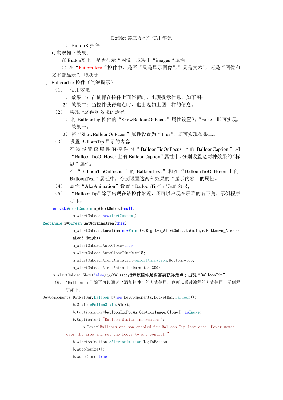
1、DotNet第三方控件使用笔记1) ButtonX控件可实现如下效果:在ButtonX上,是否显示“图像,取决于“images“属性2)在“buttomItem“控件中,是否“只是显示图像”,”只是文本”,还是“图像和文本都显示”,取决于1、 BalloonTio控件(气泡提示)(1) 使用效果1) 效果一:在鼠标在控件上面停留时,出现提示信息,如下图:2) 效果二:当控件获得焦点时,也出现如上图一样的信息。(2) 实现上述两种效果的途径1) 将BalloonTip控件的“ShowBalloonOnFacus”属性设置为“False”即可实现,效果一。2) 将“ShowBalloonOnFac
2、us”属性设置为“True”,即可实现效果二。(3) 设置BalloonTip显示的内容:在欲设置该属性的控件的“BalloonTioOnFocus上的BalloonCaption”和“BalloonTioOnHover上的BalloonCaption”属性中,分别设置这两种效果的“标题”属性; 在“BalloonTioOnFocus上的BalloonText”和在“BalloonTioOnHover上的BalloonText”属性中,分别设置这两种效果的“显示内容”的属性。(4) 属性“AlerAnimation”设置“BalloonTip”出现的效果,(5) “BalloonTip”除了出
3、现在该控件附近,还可以出现在屏幕的右下角,示例程序如下:privateAlertCustom m_AlertOnLoad=null;m_AlertOnLoad=newAlertCustom();Rectangle r=Screen.GetWorkingArea(this);m_AlertOnLoad.Location=newPoint(r.Right-m_AlertOnLoad.Width,r.Bottom-m_AlertOnLoad.Height);m_AlertOnLoad.AutoClose=true;m_AlertOnLoad.AutoCloseTimeOut=15;m_AlertOn
4、Load.AlertAnimation=eAlertAnimation.BottomToTop;m_AlertOnLoad.AlertAnimationDuration=300;m_AlertOnLoad.Show(false);/false:指示该控件是否需要获得焦点才出现“BalloonTip”(6)“BalloonTip”除了可以通过“添加控件”的方式使用,也可以通过编程的方式使用,示例程序如下:DevComponents.DotNetBar.Balloon b=new DevComponents.DotNetBar.Balloon();b.Style=eBallonStyle.Aler
5、t;b.CaptionImage=balloonTipFocus.CaptionImage.Clone() asImage;b.CaptionText=Balloon Status Information;b.Text=Balloons are now enabled for Balloon Tip Test area. Hover mouse over the area and set the focus to any control.;b.AlertAnimation=eAlertAnimation.TopToBottom;b.AutoResize();b.AutoClose=true;b
6、.AutoCloseTimeOut=4;b.Owner=this;/指示父控件b.Show(button2,false);/button2:指示在那个控件附近出现“BalloonTip” (7)还可以对“BalloonTip”出现时的效果进行程序控制,如下:/ BalloonTriggerControl property returns control that invoked balloon/ BalloonTriggerControl属性返回触发“BalloonTip”的控件if(balloonTipHover.BalloonTriggerControl=groupBox1)/ Ballo
7、onControl is already prepared Balloon control that is just about to be displayed/ Setting BalloonControl to null will cancel balloon displayPoint p=Control.MousePosition;/ Adjust cursor position so cursor is below tipp.Offset(-balloonTipHover.BalloonControl.TipOffset,balloonTipHover.BalloonControl.T
8、ipLength+4);/Offset属性将点p进行平移balloonTipHover.BalloonControl.Location=p;(8)与之类似的是DotNetToolTip所有控件都有的“ToolTip”属性,也可以是控件在鼠标划过时出现类似的东西,如下图2、 DotNetBarManager控件与Bar控件的使用 示例效果如下图:(1) DotNetBarManager控件 -将该控件添加到工程后,将给Bar控件提供了“停靠点(DockSite)”,可以实现是工具栏在窗体的“上、下、左、右“摆放。 可以通过程序实现,也可以通过“属性页“的”Dock“属性进行设置。 bar.Doc
9、kSide = eDockSide.Top;(2) DotNetBarManager控件,通过右键菜单可以轻松实现如下图所示的布局。通过拖动也可以轻易的实现如下视图的布局与上图相应的代码:/ Create new document and add it to existing barDevComponents.DotNetBar.DockContainerItem dockItem=new DevComponents.DotNetBar.DockContainerItem();dockItem.Text=Custom Document;/ Add control to itTextBox t=
10、newTextBox();t.AutoSize=false;t.Multiline=true;t.Text=dockItem.Text;/ PanelDockContainer will be used to host any controls. It provides automatic focus management so focused/ document tab appears boldDevComponents.DotNetBar.PanelDockContainer panel = new DevComponents.DotNetBar.PanelDockContainer();
11、t.Dock = DockStyle.Fill;panel.Controls.Add(t);dockItem.Control=panel;bar1.Items.Add(dockItem);if(!bar1.Visible)bar1.Visible=true;elsebar1.RecalcLayout();/ Optimize display by disabling layout for all dock sitesdotNetBarManager1.SuspendLayout=true;tryforeach(DevComponents.DotNetBar.Bar bar in dotNetB
12、arManager1.Bars)if(bar.DockSide=DevComponents.DotNetBar.eDockSide.Document)foreach(DevComponents.DotNetBar.DockContainerItem dock in bar.Items)dock.Visible=true;if(!bar.Visible)bar.Visible=true;finallydotNetBarManager1.SuspendLayout=false;(2)下面的代码通过编程的方式实现如下图所示的功能privatevoid Form1_Load(object sender
13、, System.EventArgs e)dotNetBarManager1.DockTabChange+=newDotNetBarManager.DockTabChangeEventHandler(this.DockTabChanged);CreateBottomBarAutoHide();CreateLeftDockedBars();privatevoid DockTabChanged(object sender, DockTabChangeEventArgs e)/ Sync caption of the bar with the currently selected dock tabB
14、ar bar=sender asBar;if(bar=null | e.NewTab=null)return;bar.Text=e.NewTab.Text;privatevoid CreateBottomBarAutoHide()Bar bar=newBar(Bottom Bar in auto-hide state);bar.Name=bottomBar;bar.LayoutType=eLayoutType.DockContainer; / Dock Container Layout needed for dockable windowsbar.Stretch=true; / Dockabl
15、e windows stretch to fill containerbar.AutoHideAnimationTime=0; / Some controls do not support animation so turn it offbar.GrabHandleStyle=eGrabHandleStyle.Caption; / Dockable Windows have captionsdotNetBarManager1.Bars.Add(bar); / DotNetBar needs to be aware of the bar so it can manage its docking
16、etc./ Create hosted controlsDockContainerItem dockItem=newDockContainerItem(bottomDockItem1,First dock item);bar.Items.Add(dockItem);/ Create control that we want to host on dockable windowUserControl1 dockedControl=newUserControl1();dockedControl.label1.Text=bar.Name+ - +dockItem.Text;dockedControl
17、.BackColor=Color.Azure;dockItem.Control=dockedControl; / Specify that control is hosted on the dock containerdockItem.Height=128; / Specify the height of the dockable container and at the same time control/ Create second dock container and add it to the bardockItem=newDockContainerItem(bottomDockIte
18、m2,Second dock item);bar.Items.Add(dockItem);dockedControl=newUserControl1();dockedControl.label1.Text=bar.Name+ - +dockItem.Text;dockedControl.BackColor=Color.Aquamarine;dockItem.Control=dockedControl; / Specify that control is hosted on the dock container/ Dock bar to bottom dock sitedotNetBarMana
19、ger1.BottomDockSite.GetDocumentUIManager().Dock(bar);dockItem.Height=128; / Specify the height of the dockable container and at the same time controlbar.RecalcLayout(); / Apply all changes.bar.AutoHide=true; / Place bar in auto-hide mode. Bar needs to be docked before it can be places in auto-hide m
20、odeprivatevoid CreateLeftDockedBars()/ Dock first two bars side by side and dock third bar next to them.Bar bar=newBar(Bar1);bar.Name=leftBar1;bar.LayoutType=eLayoutType.DockContainer; / Dock Container Layout needed for dockable windowsbar.Stretch=true; / Dockable windows stretch to fill containerba
21、r.AutoHideAnimationTime=0; / Some controls do not support animation so turn it offbar.GrabHandleStyle=eGrabHandleStyle.Caption; / Dockable Windows have captionsbar.CanHide=true;/ Create DockContainerItem for the bar. The item should be added before the bar is docked.DockContainerItem dockItem=newDoc
22、kContainerItem(leftDockItem1,Top Left Dock Container);bar.Items.Add(dockItem);/ Create control that is hosted on dock containerUserControl1 dockedControl=newUserControl1();dockedControl.label1.Text=bar.Name+ - +dockItem.Text;dockedControl.BackColor=Color.Khaki;dockItem.Control=dockedControl; / Speci
23、fy that control is hosted on the dock containerdotNetBarManager1.Bars.Add(bar); / DotNetBar needs to be aware of the bar so it can manage its docking etc.dotNetBarManager1.LeftDockSite.GetDocumentUIManager().Dock(bar); /Performs actual docking of the Bar to the specified dock sitedockItem.Width=128;
24、 / Specify Width of dock container item after it is docked/ Create second bar and dock it below the first bar but still on the same lineBar bar2=newBar(Bar2);bar2.Name=leftBar2;bar2.LayoutType=eLayoutType.DockContainer; / Dock Container Layout needed for dockable windowsbar2.AutoHideAnimationTime=0;
25、 / Some controls do not support animation so turn it offbar2.Stretch=true; / Dockable windows stretch to fill containerbar2.CanHide=true;bar2.GrabHandleStyle=eGrabHandleStyle.Caption; / Dockable Windows have captions/ Add new Dock Container to the bar, should be done before adding the bar so size ca
26、n be calculated properlydockItem=newDockContainerItem(leftDockItem2,Bottom Left Dock Container);bar2.Items.Add(dockItem);/ Create control that is hosted on dock containerdockedControl=newUserControl1();dockedControl.label1.Text=bar.Name+ - +dockItem.Text;dockedControl.BackColor=Color.Lavender;dockIt
27、em.Control=dockedControl; / Specify that control is hosted on the dock containerdotNetBarManager1.Bars.Add(bar2); / DotNetBar needs to be aware of the bar so it can manage its docking etc.dotNetBarManager1.LeftDockSite.GetDocumentUIManager().Dock(bar, bar2, eDockSide.Bottom); / Dock new bar2 below t
28、he bar that we created previously/ Create third bar that is docked next to the first and second/ i.e. on the line 1bar=newBar(Bar3);bar.Name=leftBar3;bar.LayoutType=eLayoutType.DockContainer; / Dock Container Layout needed for dockable windowsbar.AutoHideAnimationTime=0; / Some controls do not suppo
29、rt animation so turn it offbar.Stretch=true; / Dockable windows stretch to fill containerbar.CanHide=true;bar.GrabHandleStyle=eGrabHandleStyle.Caption; / Dockable Windows have captionsdockItem=newDockContainerItem(leftDockItem3,Left Dock Container line 1);bar.Items.Add(dockItem);/ Create control tha
30、t is hosted on dock containerdockedControl=newUserControl1();dockedControl.label1.Text=bar.Name+ - +dockItem.Text;dockedControl.BackColor=Color.LemonChiffon;dockItem.Control=dockedControl; / Specify that control is hosted on the dock containerdotNetBarManager1.Bars.Add(bar); / DotNetBar needs to be
31、aware of the bar so it can manage its docking etc.dotNetBarManager1.LeftDockSite.GetDocumentUIManager().Dock(bar);/ Setting the width of the dock site will also scale the bars docked inside,/ however the size should be large enough to accomodate all bars including the constraints like MinimumSize et
32、c.dotNetBarManager1.LeftDockSite.Width = 150;BaseItem:Defines the base class for items that are used by DotNetBar示例:BaseItem item = sender asBaseItem;(3) 添加“菜单项“也可以通过两种方式实现1)“可视化“的方式在“设计器“里可以通过”右键“来实现; 2)程序的方法privatevoid CreateBar()/ Create a new Bar /创建BarBar bar=newBar(Standard);bar.CanHide=true;b
33、ar.Style=eDotNetBarStyle.Office2003;bar.GrabHandleStyle=eGrabHandleStyle.StripeFlat;bar.WrapItemsDock=true;bar.WrapItemsFloat=false;/ Add Items to it /向Bar内添加项ButtonItem item, fileItem;/ New添加新建item=newButtonItem(bNew);-item.ImageIndex=0; / item.Image = imageList1.Images0;-item.Text=&New;item.Shortc
34、uts.Add(eShortcut.CtrlN);item.Category=Standard;bar.Items.Add(item);m_DotNetBar.Items.Add(item.Copy();/ This will create Category Entry/ Openitem=newButtonItem(bOpen);item.ImageIndex=1;item.Text=&Open;item.Shortcuts.Add(eShortcut.CtrlO);item.Category=Standard;bar.Items.Add(item);m_DotNetBar.Items.Ad
35、d(item.Copy();/ Add Sub items to the Open, something like recently used files.fileItem=newButtonItem(file1);fileItem.Text=&1. File1.txt;item.SubItems.Add(fileItem);fileItem=newButtonItem(file2);fileItem.Text=&2. File2.txt;item.SubItems.Add(fileItem);fileItem=newButtonItem(file3);fileItem.Text=&3. Fi
36、le3.txt;item.SubItems.Add(fileItem);fileItem=newButtonItem(file4);fileItem.Text=&4. File4.txt;item.SubItems.Add(fileItem);fileItem=newButtonItem(file5);fileItem.Text=&5. File5.txt;item.SubItems.Add(fileItem);/ Closeitem=newButtonItem(bClose);item.ImageIndex=2;item.Text=&Close;item.Shortcuts.Add(eSho
37、rtcut.CtrlX);item.Category=Standard;bar.Items.Add(item);m_DotNetBar.Items.Add(item.Copy();/ Saveitem=newButtonItem(bSave);item.ImageIndex=3;item.Text=&Save;item.Shortcuts.Add(eShortcut.CtrlS);item.Category=Standard;bar.Items.Add(item);m_DotNetBar.Items.Add(item.Copy();/ Print Previewitem=newButtonIt
38、em(bPrintPreview);item.ImageIndex=6;item.Text=Print Pre&view;item.Category=Standard;item.BeginGroup=true;bar.Items.Add(item);m_DotNetBar.Items.Add(item.Copy();/ Printitem=newButtonItem(bPrint);item.ImageIndex=5;item.Text=&Print;item.Category=Standard;item.Shortcuts.Add(eShortcut.CtrlP);bar.Items.Add
39、(item);m_DotNetBar.Items.Add(item.Copy();/ E-Mailitem=newButtonItem(bEmail);item.ImageIndex=4;item.Text=&Email;item.Category=Standard;item.BeginGroup=true;bar.Items.Add(item);m_DotNetBar.Items.Add(item.Copy();/ Customize Item添加“添加/删除“按钮CustomizeItem citem=newCustomizeItem();bar.Items.Add(citem);/ Si
40、nce we will be using ImageList bar have to be added to the DotNetBar Manager /将Bar加入DotNetBar Managerm_DotNetBar.Bars.Add(bar);bar.DockSide=eDockSide.Top;(4) 为所有选项添加“事件“this.m_DotNetBar.ItemClick += new System.EventHandler(this.BarItemClick);-privatevoidBarItemClick(object sender, EventArgs e) BaseI
41、tem item = sender asBaseItem;if (item = null | item.Name = | item.SystemItem)return;MessageBox.Show(Item + item.Name + clicked); (4)/设置窗体的大小AutoScaleBaseSize 属性的值在窗体显示时使用,用来计算该窗体的缩放因子。窗体将自动缩放基大小(用作与系统的字体大小进行比较的基准),以确定使用自动缩放时窗体的缩放量。如果要确定根据特定字体窗体将自动缩放到的大小,请使用 GetAutoScaleSize 方法。示例:this.AutoScaleBaseS
42、ize = new System.Drawing.Size(11, 17);该属性将按着Size(a,b)内a与b的比例大小自动调整窗口大小,但是值得注意的是:a与b的绝对值越大,窗口越小。/设置工作区域的大小this.ClientSize = new System.Drawing.Size(351, 207);/(5)ImageList组件1)、概述ImageList组件就是一个图像列表。一般情况下,这个属性用于存储一个图像集合,这些图像用作工具栏图标或TreeView控件上的图标。许多控件都包含ImageList属性。这个属性一般和ImageIndex属性一起使用。ImageList属性设
43、置为ImageList组件的一个实例,ImageIndex属性设置为ImageList中应在控件中显示的图像的索引。使用ImageIndex.Images属性的Add方法可以把图像添加到ImageList组件中。Images属性返回一个ImageCollection。两个最常用的属性是ImageSize和ColorDepth。ImageSize使用Size结构作为其值。其默认值是1616,但可以取1256之间的任意值。ColorDepth使用ColorDepth枚举作为其值。颜色深度值可以从4位32位。在.NET Framework 1.1中,默认是ColorDepth.Depth8Bit。2
44、)、示例eList imageList1;this.imageList1.ImageStream = (System.Windows.Forms.ImageListStreamer)(resources.GetObject(imageList1.ImageStream);this.imageList1.TransparentColor = System.Drawing.Color.Transparent;/下面加几个Imagethis.imageList1.Images.SetKeyName(0, acrobat.ico);this.imageList1.Images.SetKeyName(1
45、, address book.ico);this.imageList1.Images.SetKeyName(2, adjust colour.ico);/把imageList1赋给treeView1this.treeView1.ImageIndex = 0;this.treeView1.ImageList = this.imageList1;ion = new System.Drawing.Point(3, 3);this.treeView1.Name = treeView1;this.treeView1.SelectedImageIndex = 0;this.treeView1.Size =
46、 new System.Drawing.Size(579, 450);this.treeView1.TabIndex = 0;/以上code在Designer完成/在添加TreeNode的时候, 把Image加上/未选中时, 这个node显示imageList1中的acrobat.ico, 选中后显示address book.icoTreeNode node = new TreeNode(TreeNodeName, 0, 1);treeView1.Nodes.Add(node);treeView1.ExpandAll();3)、讨论 #).ImageList里面的图片的颜色 #)ImageLi
47、st里面的图片的大小 引起ImageList里面图片颜色失真的原因是在Design-Time就在VS.NET中往ImageList里面添加了Images。 当用户一边在“Image Collection Editor”对话框里面添加图片,VS.NET一边就已经把这些图片装载到resource文件里面了。这样,以后程序运行时就只需要访问resource文件就可以载入所有图片而不需要依赖原始的图片文件。 但是问题在于从结果看,当VS.NET在Design-Time往resource文件里面添加图片时并没有使用用户指定的ColorDepth(例如Depth32Bit),而用了ImageList.Co
48、lorDepth的默认值(Depth8Bit)。这样,等程序运行时,即使ImageList.ColorDepth指定了Depth32Bit也无济于事,因为原始的素材本身只有8bit的颜色。这基本上就是waki的问题的原因。 因此,解决方案是:不在Design-Time用VS.NET往ImageList里面添加图片,而是在程序运行时先指定32Bit的ColorDepth,然后再添加图片,如以下例子代码: olorDepth=ColorDepth.Depth32Bit; this.imageList1.Images.Add(Image.FromFile(C:Inetpubwwwrootwinxp.
49、gif); this.imageList1.Images.Add(Image.FromFile(C:Inetpubwwwrootimagesinit_dotnet.gif); this.imageList1.Images.Add(Image.FromFile(C:Inetpubwwwrootimagesmslogo.gif); this.imageList1.Images.Add(Image.FromFile(C:Inetpubwwwrootimagesmslogo2.gif); 这里需要注意的是,必须先指定ColorDepth,然后再添加图片。因为对ColorDepth赋值会清空所有图片。B
50、TW,ImageList.ColorDepth的默认值是Depth8Bit,而非文档上所述Depth4Bit。这一点很容易可以通过写一段例子代码来验证,也可以通过很多Decompiler来查看ImageList的构造函数的实现来验证。 的确,通过ImageList.Imagesi获得图片的大小都是统一的,都等于ImageList.ImageSize。这个问题的原因在于ImageList在返回Imagesi的过程中并没有返回原始的图片,而是按照ImageList.ImageSize创建了一个新的Bitmap,并把原始图片的内容重新绘制上去以后再返回给用户。关于这一点,可以用一些Decompile
51、r工具如ILDASM.exe或者Anakrino通过察看私有函数ImageList.GetBitmap(int index)来验证。我想现在paulluo0739应该能够理解为什么ImageList里面的图片都是一样大的了。 ImageSize同ColorDepth类似,也不宜在运行时改动,一旦重新赋值,就会清空所有的图片。因此,如果程序运行时需要某一图片的不同大小的版本,可以考虑使用多个不同ImageSize的ImageList。 (6)关于ImageList组件的用法还存在问题3、控件BubbleBar的使用(1)使用效果(2)其实使用很简单,只有将BubbleBar控件拖到窗体上,然后,
52、就可以添加“Tab“和”Button“了。(3)一些有用的语句privatevoid bubbleButton_Click(object sender, DevComponents.DotNetBar.ClickEventArgs e)DevComponents.DotNetBar.BubbleButton button=sender as DevComponents.DotNetBar.BubbleButton;textBox1.Text=button.Name+, +button.TooltipText;privatevoid checkBox2_CheckedChanged(object
53、 sender, System.EventArgs e)if(checkBox2.Checked)bubbleBar1.ButtonBackgroundStretch=true;else bubbleBar1.ButtonBackgroundStretch=false;/ Apply UI changes and refresh /刷新bubbleBar1.RecalcLayout();bubbleBar1.Refresh();privatevoid numericUpDown1_ValueChanged(object sender, System.EventArgs e)/ It is be
54、st that images assigned to the control always match this size for best appearancebubbleBar1.ImageSizeNormal=newSize(int)numericUpDown1.Value,(int)numericUpDown1.Value);bubbleBar1.RecalcLayout();bubbleBar1.Refresh();4、 控件DataGridViewX与控件Color Picker的使用1) 控件DataGridView与DataGridView的基本用法类似2) DataGridV
55、iew有自动按列排序的功能3) dataGridViewX1.SelectedRows.Count 4) dataGridViewX1.SelectedRows0.Cells0.Value.ToString() (2#)DataGridView的示例代码#region 设置DataGridView的显示格式.DataGridViewAutoSizeColumnsMode.Fill; dgvMachinceList.AutoGenerateColumns = false; dgvMachinceList.AllowUserToAddRows = false; dgvMachinceList.Al
56、lowUserToResizeColumns = true;/TabControlPanel tcp;foreach (Control c intabControl1.Controls)if (c isTabControlPanel) tcp = (TabControlPanel)c; tcp.Style.BackColor1.Color = Color.FromArgb(227, 239, 255); tcp.Style.BackColor2.Color = Color.FromArgb(175, 210, 255);foreach (Control ctrl in tcp.Controls
57、) if (ctrl isDevComponents.DotNetBar.Controls.DataGridViewX) DevComponents.DotNetBar.Controls.DataGridViewX dgv = (DevComponents.DotNetBar.Controls.DataGridViewX)ctrl; dgv.AutoGenerateColumns = false; dgv.BackgroundColor = Color.FromArgb(227, 239, 255); dgv.AllowUserToAddRows = false; dgv.AllowUserT
58、oDeleteRows = false;/dgv.AutoSize = false; dgv.AutoSizeColumnsMode = System.Windows.Forms.DataGridViewAutoSizeColumnsMode.Fill; dgv.AutoSizeRowsMode = System.Windows.Forms.DataGridViewAutoSizeRowsMode.AllCells; dgv.AllowUserToResizeColumns = true;/dgv.RowHeadersWidth = 900; dgv.MultiSelect = false; dgv.ReadOnly = true; dgv.RowHeadersVisible = false; dgv.ScrollBars = System.Windows.Forms.ScrollBars.Both; dgv.SelectionMode = System.Windows.Forms.DataGridViewSelectionMode.FullRowSelect; dgvHardwareList.DataBindings.Clear();
- 温馨提示:
1: 本站所有资源如无特殊说明,都需要本地电脑安装OFFICE2007和PDF阅读器。图纸软件为CAD,CAXA,PROE,UG,SolidWorks等.压缩文件请下载最新的WinRAR软件解压。
2: 本站的文档不包含任何第三方提供的附件图纸等,如果需要附件,请联系上传者。文件的所有权益归上传用户所有。
3.本站RAR压缩包中若带图纸,网页内容里面会有图纸预览,若没有图纸预览就没有图纸。
4. 未经权益所有人同意不得将文件中的内容挪作商业或盈利用途。
5. 装配图网仅提供信息存储空间,仅对用户上传内容的表现方式做保护处理,对用户上传分享的文档内容本身不做任何修改或编辑,并不能对任何下载内容负责。
6. 下载文件中如有侵权或不适当内容,请与我们联系,我们立即纠正。
7. 本站不保证下载资源的准确性、安全性和完整性, 同时也不承担用户因使用这些下载资源对自己和他人造成任何形式的伤害或损失。
